BRIEF:
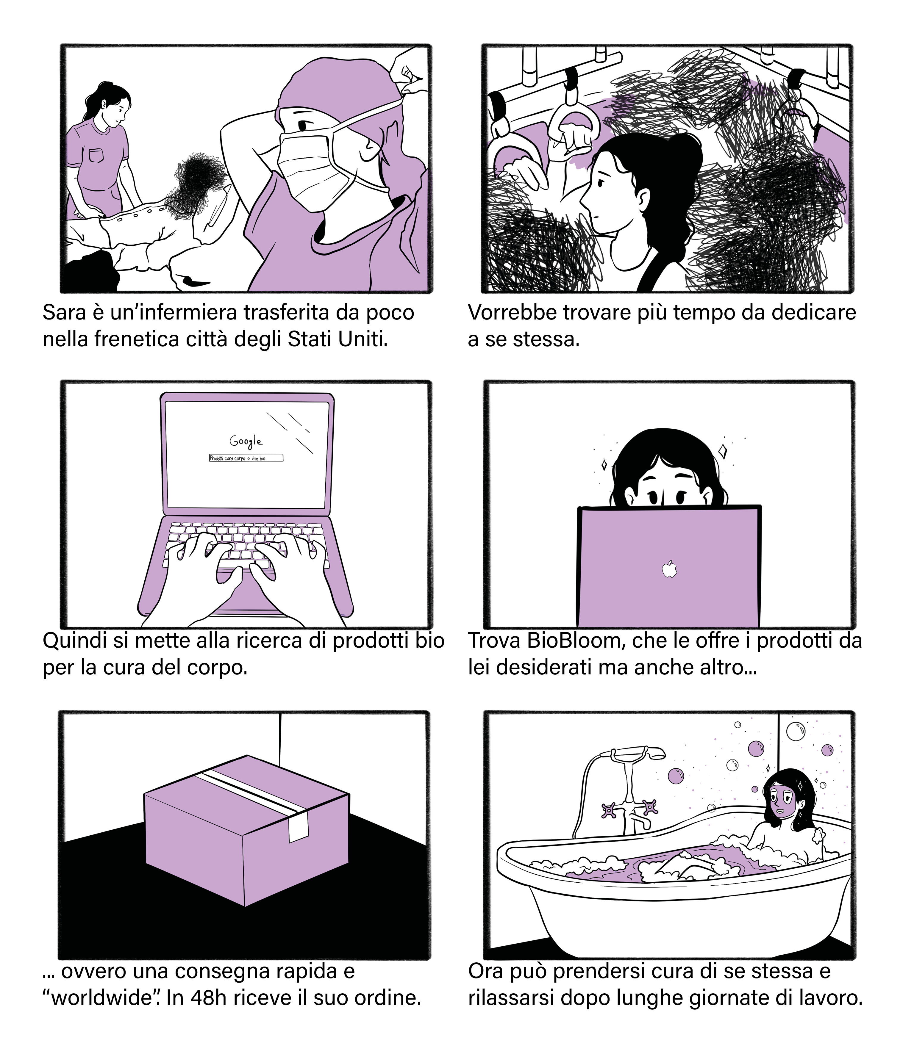
A young couple used to spend all their free time searching for medicinal herbs, which they used to create creams and lotions. They started by giving their cosmetics and creams to relatives and friends, and that brought their first enthusiastic customers. They then decided to turn their passion into a business, founding BioBloom. Their vision was to develop beauty and personal care products that were natural, effective, and environmentally friendly. This spirit still guides their work today. Over the years, BioBloom has earned an international reputation in natural cosmetics, becoming a benchmark for those seeking sustainable and effective beauty products.
REASON WHY:
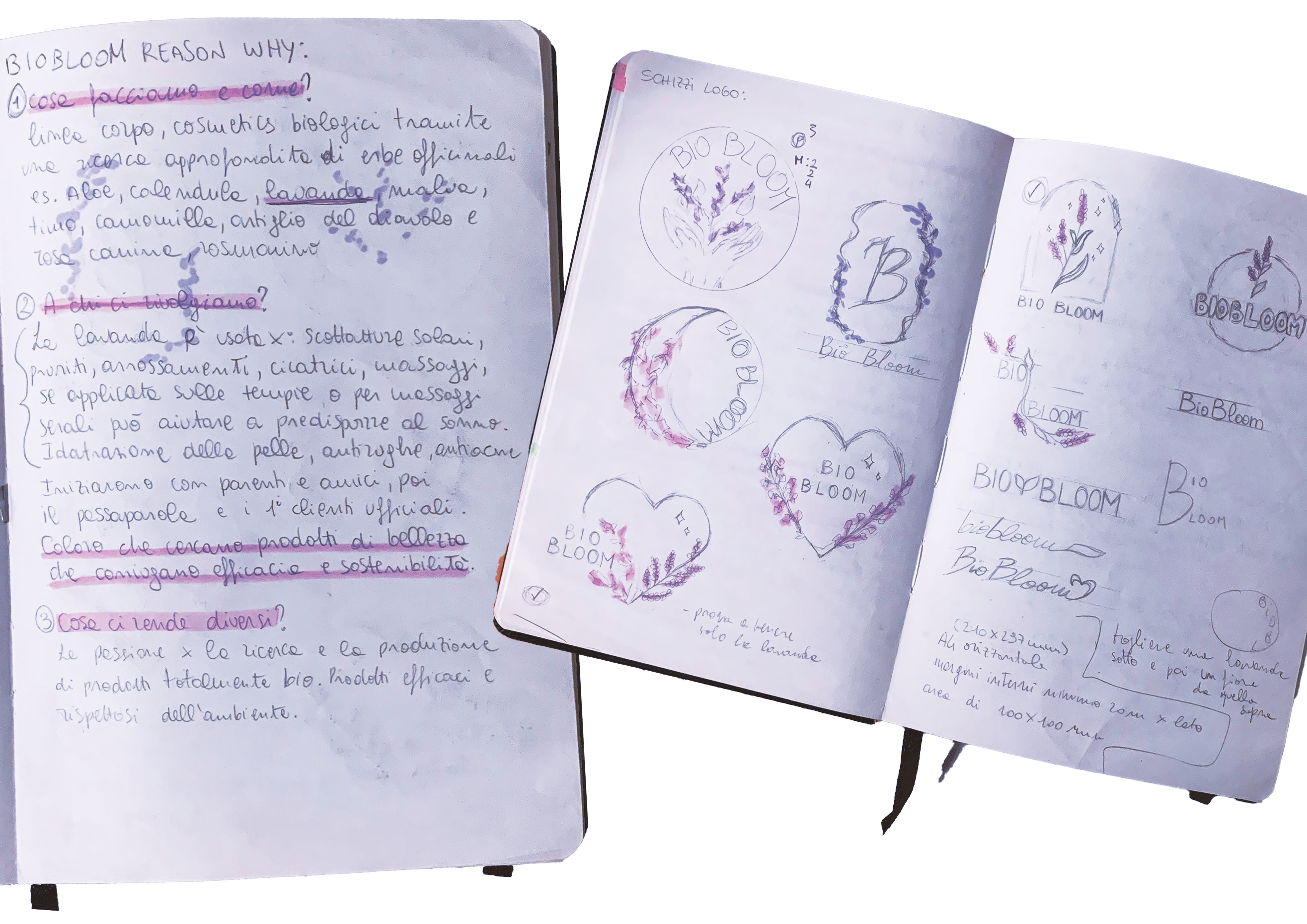
1. What do we do and how? Body care line, organic cosmetics through in-depth research of medicinal herbs (e.g., aloe, calendula, lavender, mallow, thyme, chamomile, etc.).
2. Who is our target audience? They started with relatives and friends, that brought their first official customers. Those who seek beauty products that combine effectiveness and sustainability.
3. What makes us different? A passion for researching and producing completely organic products. Effective and environmentally friendly products.
RESEARCH AND ANALYSIS:
After establishing a general direction, I then analyzed the market of eco-friendly companies and/or competitors in the cosmetic and beauty care industry.
LOGO:
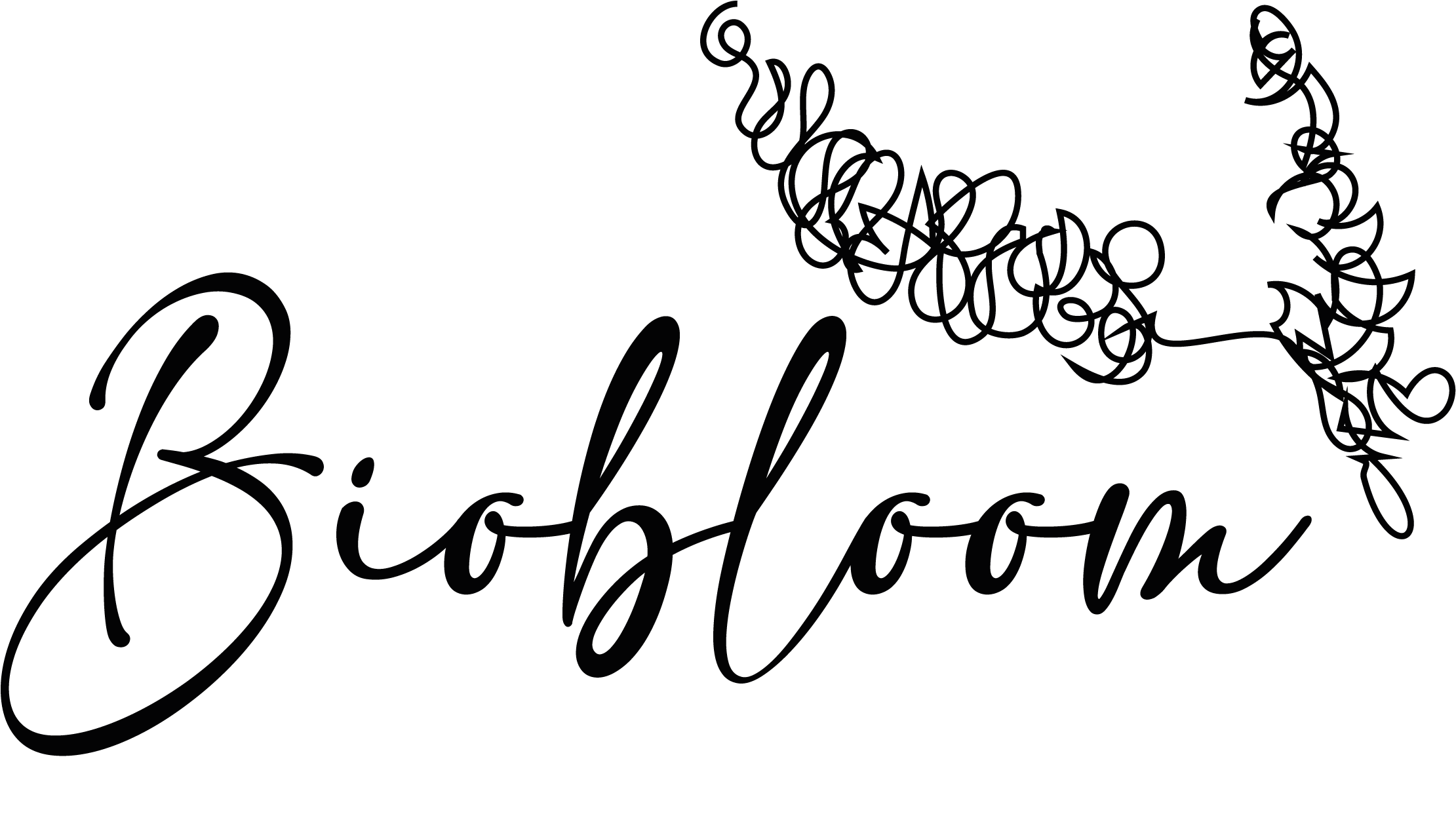
Starting with various sketches on paper, I then moved on to digital sketches, eventually arriving at a final logo that is elegant and simple.
COLOR PALETTE:
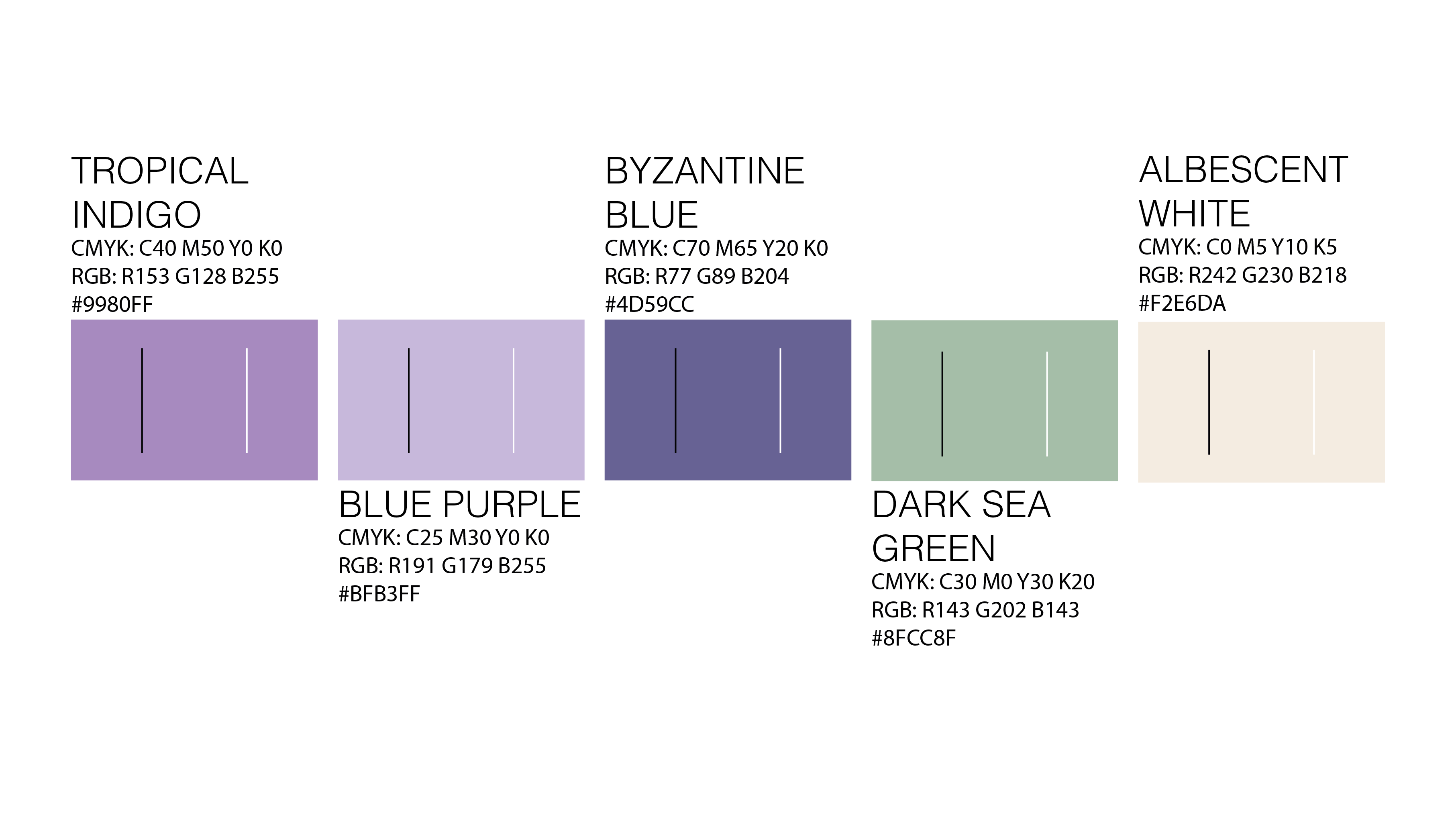
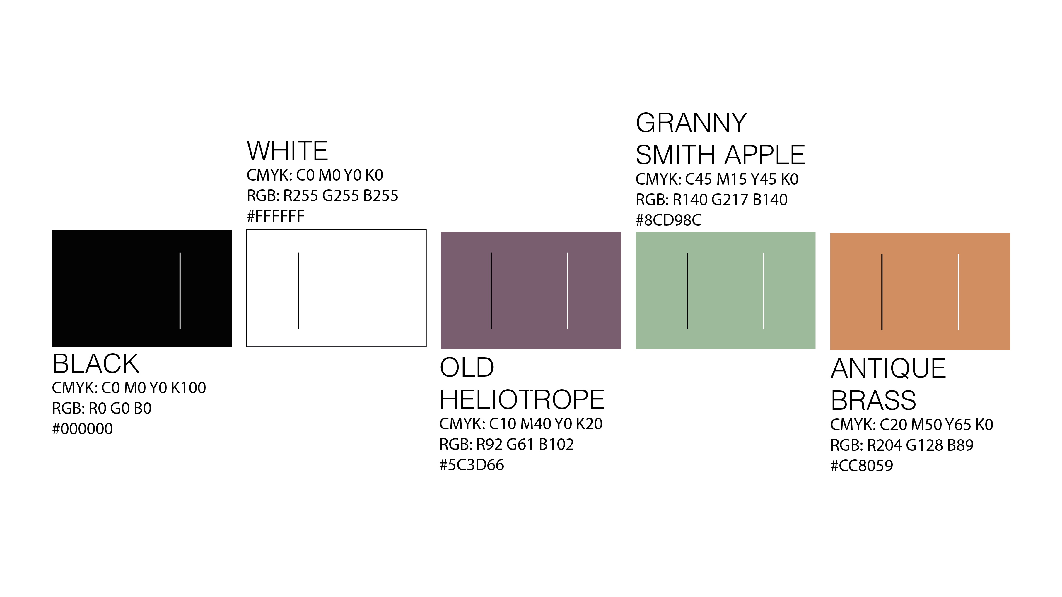
For the choice of colors I got inspired by nature, especially by the lavender which became the symbol of the company and the logo itself.
OFFICIAL FONTS:
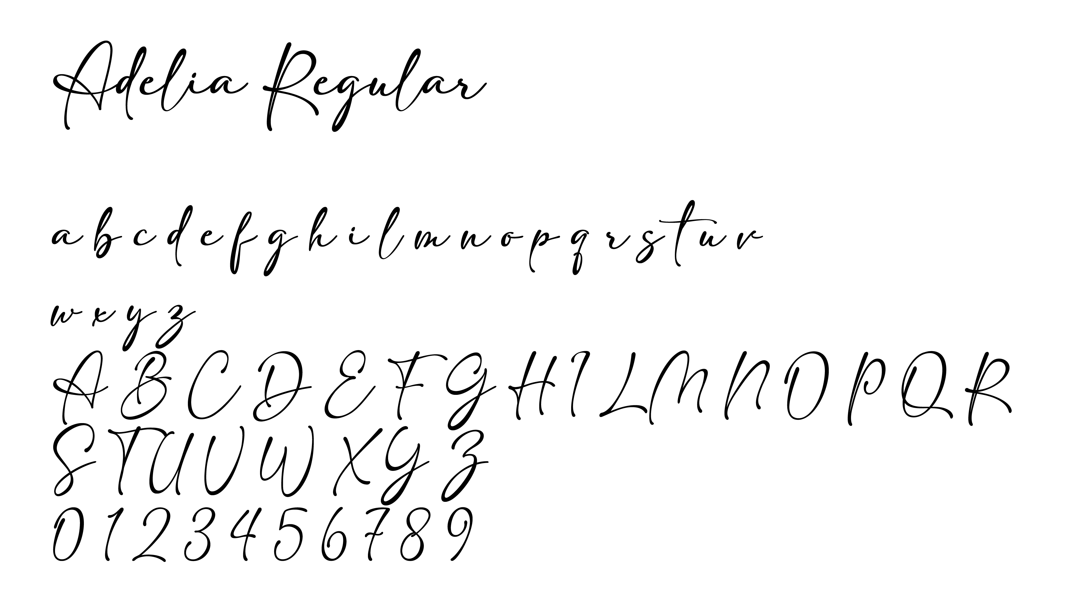
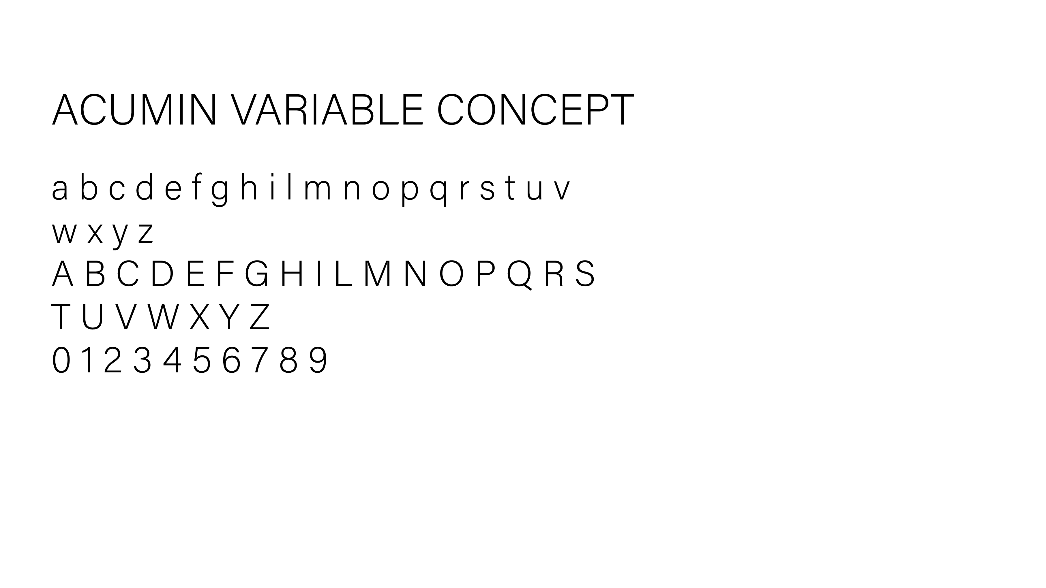
I thought that the logo needed something elegant, simple but at the same time something that could remind of the lavender’s drawing style, hence the calligraphy style for it. While for the institutional font I tried to stay on the elegant style but with a simpler effect.
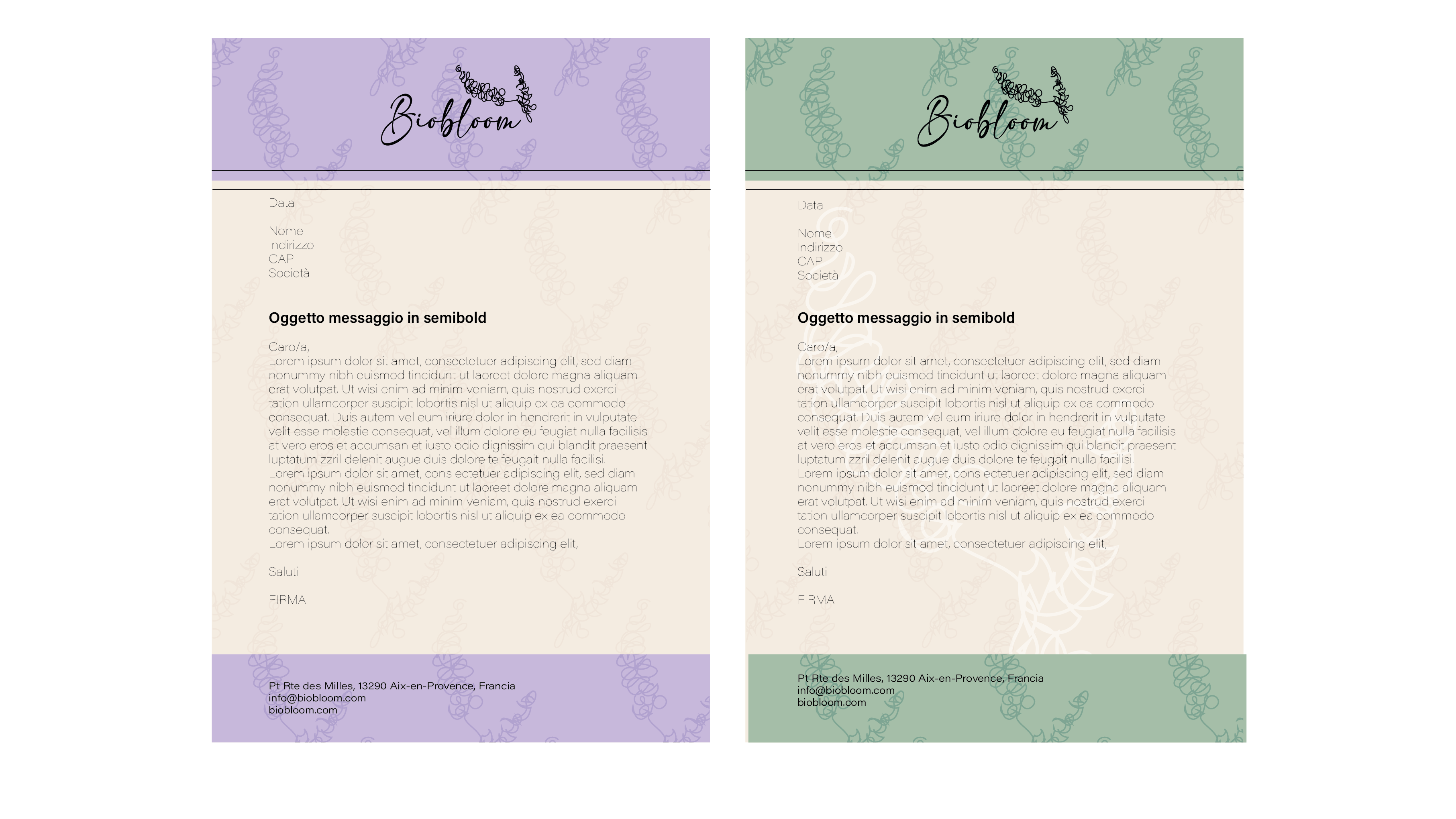
PRINTED MATERIAL:
MERCHANDISING AND ADVERTISING:
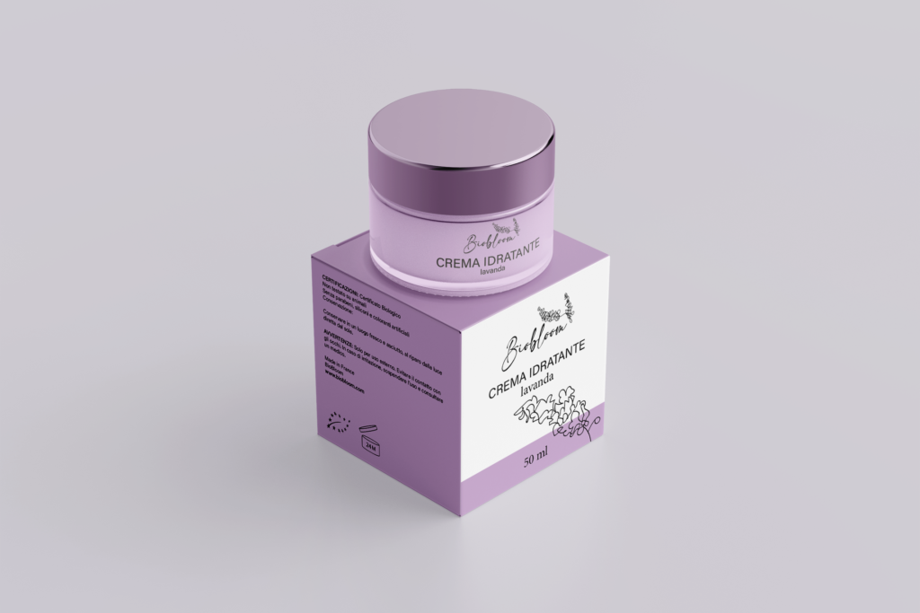
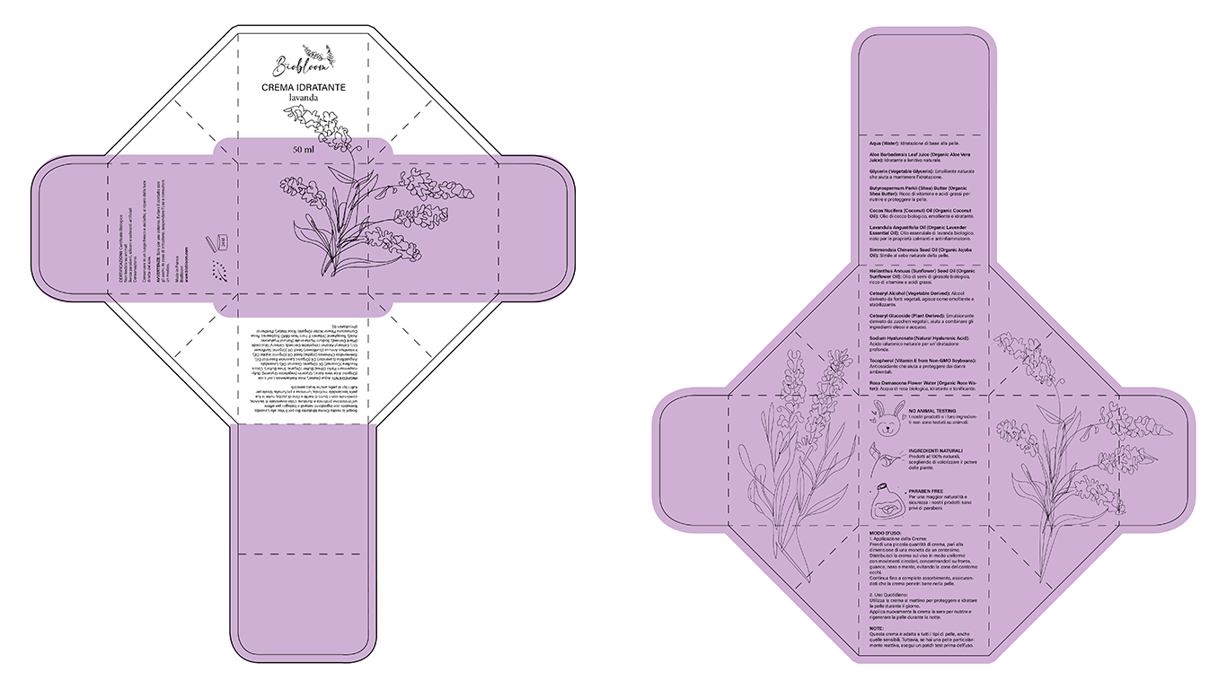
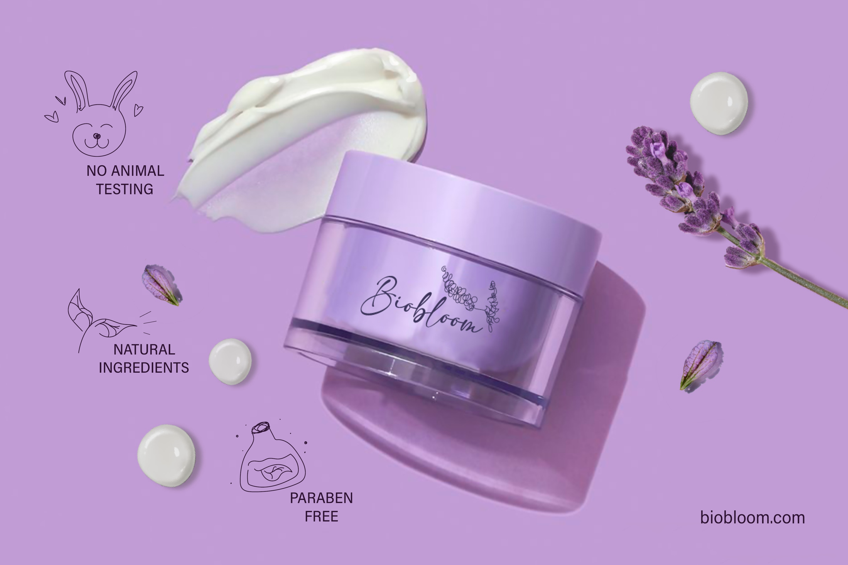
For the packaging I decided on something that could be created without glue, while for its graphic I worked on the draw of the main ingredient used for the product, in this case I stayed on the lavender idea, and did it with a style that reminds of the logo. Since it’s without glue it can be unfolded/opened easily and because of this on the inside I’ve put the ingredients and all the info about them and their benefits, concluding then with the method of use.
DIGITAL:
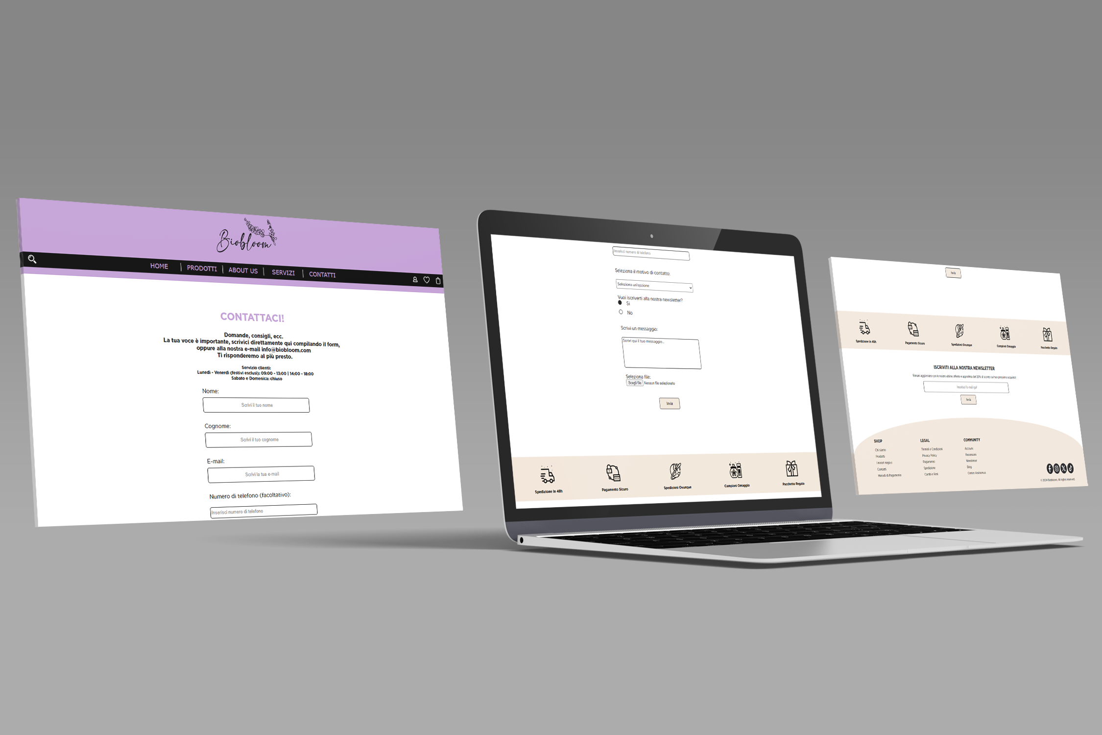
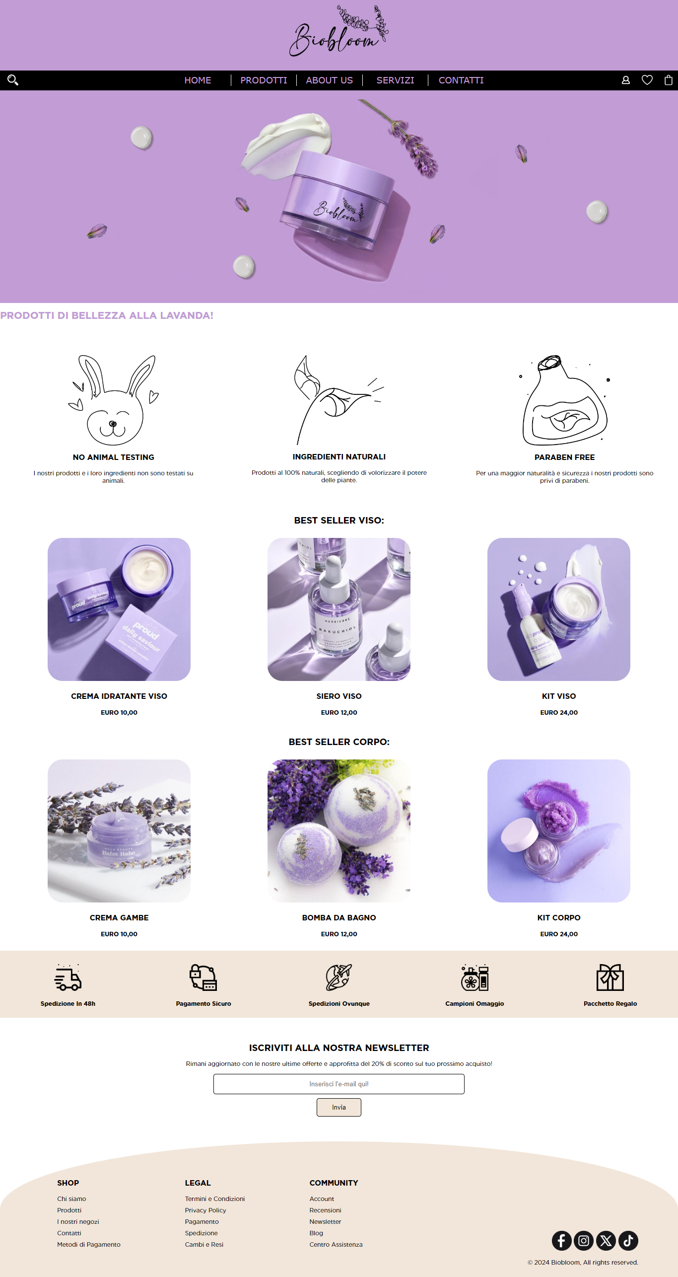
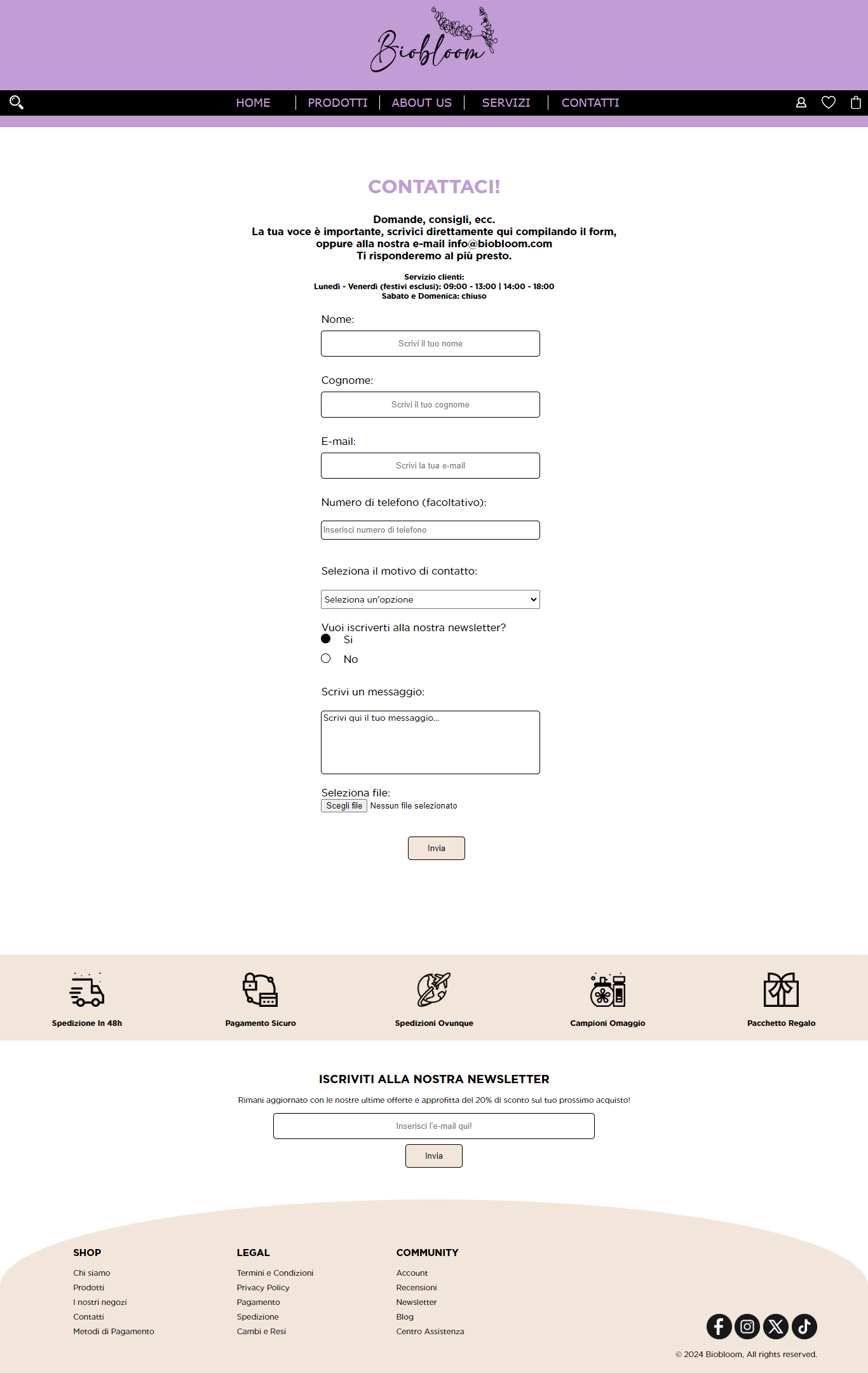
USER RESEARCH:
