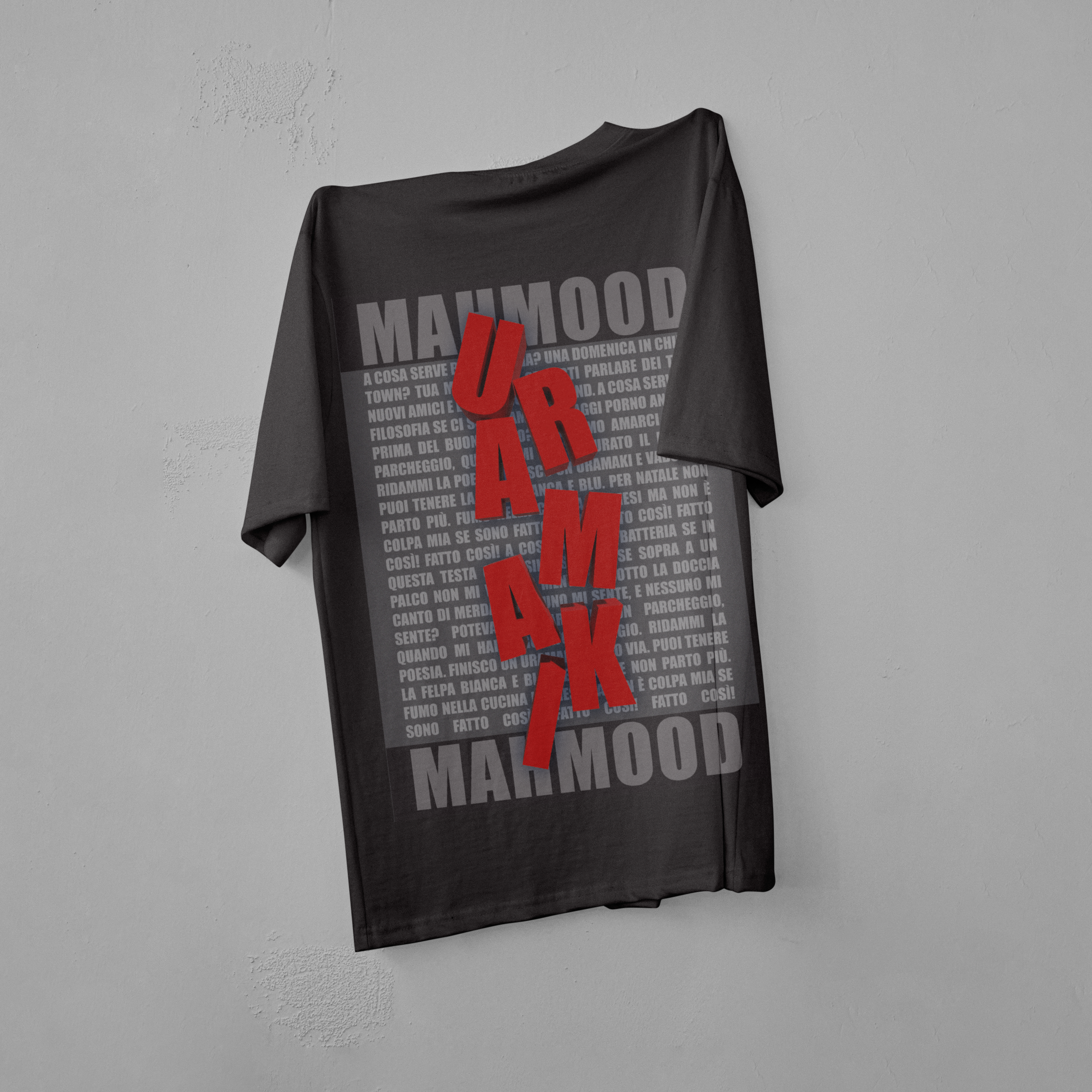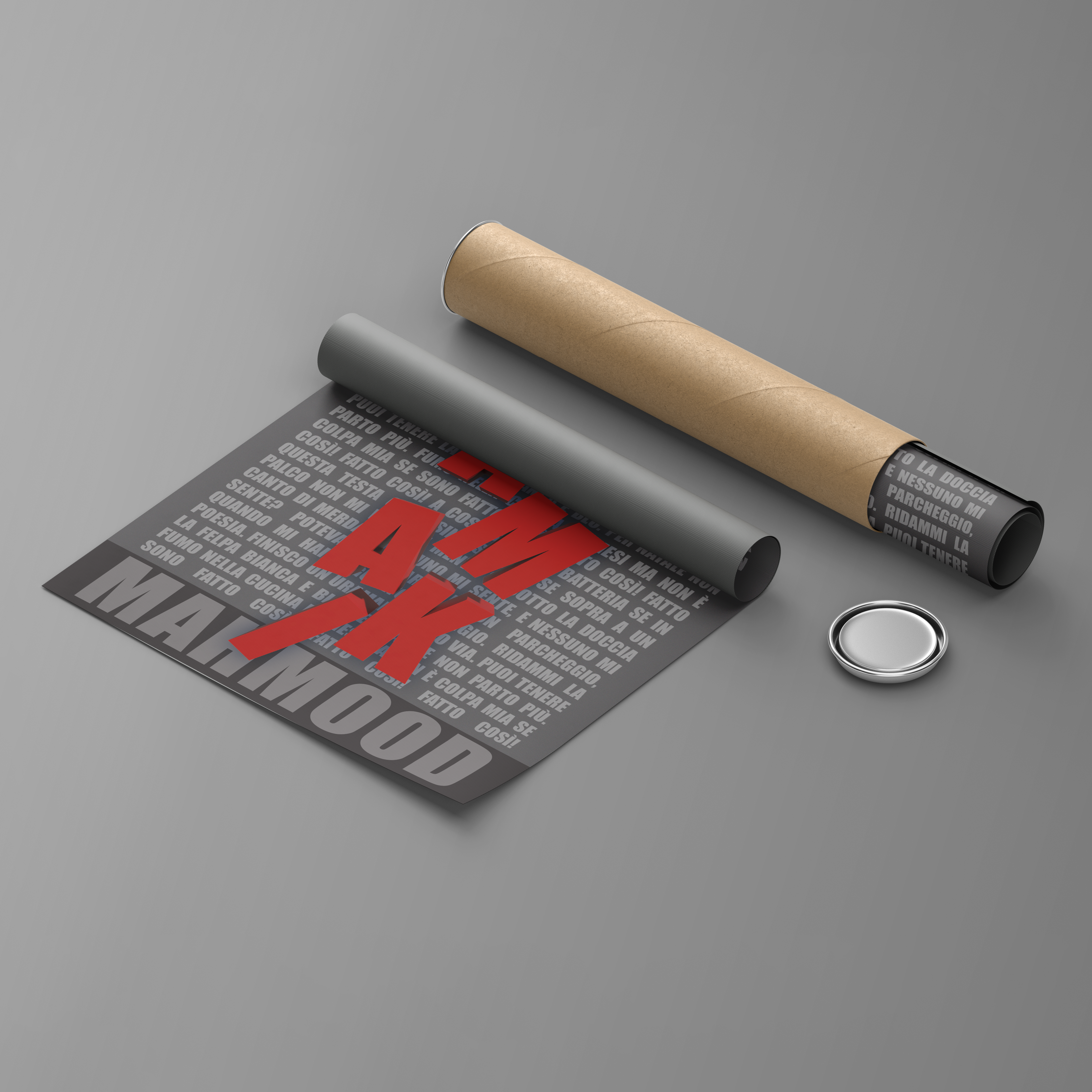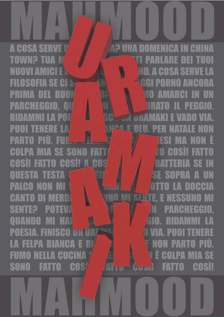

This project focuses on a typographic exploration inspired by the song “Uramaki” by Mahmood.
The design combines bold, three-dimensional text with lyrical content to create a visually dynamic piece that reflects the energy and style of the song. The vertical orientation and striking color choices were intentional decisions to capture attention and convey the modern, edgy vibe of Mahmood’s music.
Concept and Inspiration:
This project’s concept was driven by the unique structure and rhythm of the song “Uramaki.”
The vertical, 3D text of the song title represents the bold and unconventional style of the artist but also the meaning of the song which is about falling out of love, while the background with the lyrics and Mahmood’s name grounds the composition, providing context and depth.
The design is intended to be both visually impactful and reflective of the song’s contemporary aesthetic.
Design Elements:

Color Palette: The design employs a limited color palette, primarily focusing on red, black, and gray. This minimalist approach allows the text elements to stand out, emphasizing the boldness of the 3D title and maintaining a cohesive look. The red serves as a powerful visual anchor with a certain meaning to create unity with the meaning of the song, while the black and gray provide balance and clarity.
3D Vertical Text: The song title “Uramaki” is rendered in bold, red, three-dimensional text, oriented vertically. This design choice was made to create a sense of movement and intensity, mirroring the dynamic nature of the song, meaning of a love ending and falling out of love. The red color was selected for its association with passion and energy, qualities that resonate with Mahmood’s music.
Background with Lyrics: Behind the 3D title, a rectangle serves as the backdrop, containing the lyrics of “Uramaki” and the name of the singer, Mahmood. The lyrics are presented in a subtle, contrasting color, allowing the title to remain the focal point while still integrating the text as an essential part of the overall design. The rectangle helps to frame the composition, giving it structure and balance.
Typography: The font choices are deliberate, with the 3D title using a bold, sans-serif typeface that enhances its impact and modern appeal. The lyrics and singer’s name are set in a more understated font, ensuring readability and complementing the dominant title text. The contrast between the 3D text and the flat background typography creates visual interest and depth.
Design Process:
- Final Refinements: The final stage involved refining the color palette, adjusting the spacing between elements, and ensuring the overall composition was balanced and visually compelling. The finished piece was designed to be versatile, suitable for use in various formats such as posters, album covers, or digital promotions.
- Conceptualization: The project began with an analysis of the song “Uramaki” and Mahmood’s artistic style. I aimed to capture the essence of the song’s energy and the artist’s bold persona through typography. Early sketches explored various orientations and compositions, with the vertical layout emerging as a standout choice for its uniqueness and impact.
- 3D Text Creation: The 3D text was developed using design software, focusing on achieving the right balance of depth and shadow to make the title pop off the page. The red color was carefully selected to evoke emotion and draw immediate attention to the title.
- Integration of Lyrics: The lyrics were incorporated into the background rectangle, with careful consideration of font size and placement in order to ensure they complemented rather than competed with the 3D title. The goal was to create a harmonious composition that integrated the text as a cohesive element of the design.
Conclusion:
This typography project for the song “Uramaki” by Mahmood showcases a bold and contemporary design approach. The 3D vertical text and the integration of lyrics create a dynamic and engaging visual experience that reflects the energy and modernity of the artist’s music. This project demonstrates my ability to use typography not just as a tool for communication, but as a powerful visual element that can convey mood, style, and meaning.
